Huawei’s HarmonyOS 6.1 is drawing attention for a very simple reason: it has managed to reproduce the glossy, layered ”liquid glass” look that Apple showed in iOS 26, and according to Ice Universe, no Android skin is quite there yet. That is less a debate about who copied whom than a blunt assessment of execution, because the real story here is how far Huawei has pushed transparency, blur, and depth effects without making the interface look like a cheap theme pack.
In the video he shared, the interface looks polished enough to make the usual Android skin wars feel a little tired. Apple may have set the trend, but Huawei is the one being singled out for making the effect feel premium rather than gimmicky, which is a neat reversal for a company that has spent years trying to prove its software can stand on its own.
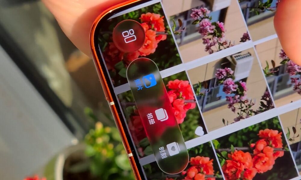
HarmonyOS 6.1 and the liquid glass look
The praise is aimed at the technique, not the aesthetics alone. Ice Universe says Huawei’s implementation is stronger because the UI elements do more than look translucent; they create a sense of layered depth that holds together across the system. That matters because most Android interfaces can borrow the visual idea, but making it feel consistent across a full shell is where many of them fall apart.
- Transparent materials are handled more cleanly than usual.
- Dynamic blur gives the interface a more expensive feel.
- Layer depth is doing real work instead of just sitting there for effect.
Android skins still have catching up to do
Ice Universe also used the moment to take a swipe at the broader Android world, saying other manufacturers still have a lot of work ahead of them. He did not frame this as a philosophical argument about borrowing Apple’s design language, which is a relief; the industry has spent enough time pretending every visual trend is either a moral failing or a masterpiece. The more interesting point is that Huawei appears to be one of the few Android players able to match Apple’s polish at a technical level.
That edge matters because visual design has become a competitive weapon again. Apple has used it to keep iOS feeling distinct, while Android brands often chase the look without the same restraint, which is how you end up with interfaces that are shiny in screenshots and exhausting in daily use. Huawei, at least in this early showing, seems to understand that the effect only works if the rendering is disciplined.
Ice Universe’s track record adds weight
The source of the praise also explains why people are listening. Ice Universe has a long history of getting major smartphone trends right early, from waterfall displays to the iPhone X notch and the iPhone 14 redesign. He has also been tied to early information on Samsung’s 200-megapixel sensor, which gives his comments extra credibility even when they read like a fanboy’s victory lap.
The open question is whether Huawei can keep this level of finish across the rest of HarmonyOS 6.1, and whether other Android makers can close the gap before translucent interfaces become old news. For now, though, Huawei has done something rare: it has made an Apple-style visual trend look native on Android, and that is enough to make the rest of the field look a bit late to the party.