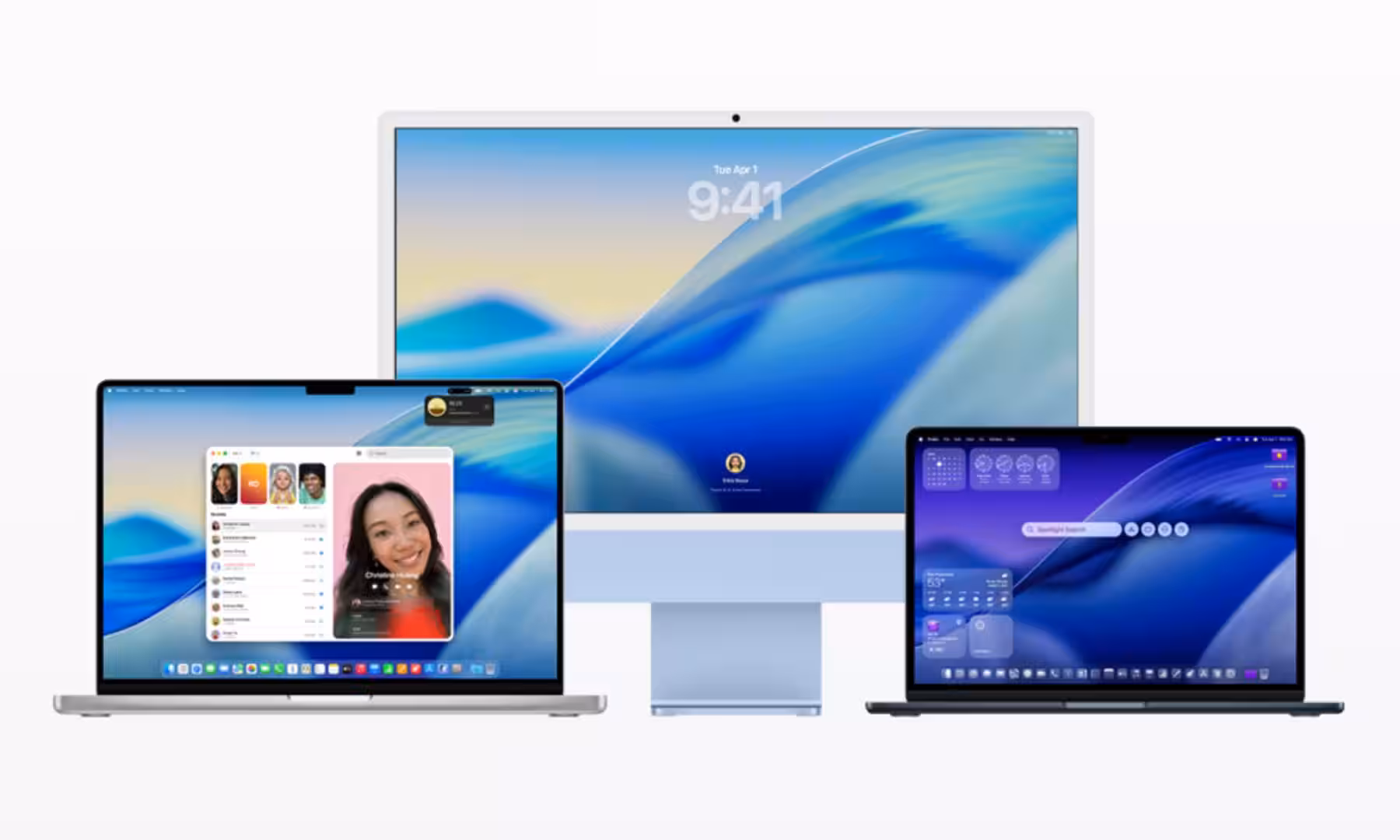
Apple is not backing away from Liquid Glass on the Mac. Instead, macOS 27 is shaping up as a cleanup job: same futuristic look, fewer headaches, and a bit less of the interface’s ”please adjust your eyes” energy.
That’s the better reading of the latest report on Apple’s next desktop release. The company apparently wants to keep the design language it introduced with macOS Tahoe, but tune it for the realities of Mac hardware rather than the glossy demo reel.
The complaints are about readability, not nostalgia
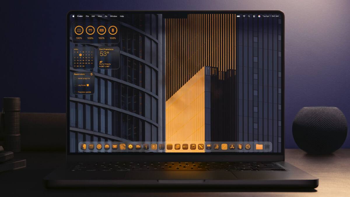
The pain points are familiar: transparency, shadows, contrast, and dense layouts that become harder to parse once the glassy effects kick in. Finder, Control Center, and text-heavy apps seem to be the main irritants, especially on larger Mac displays where layered UI can drift from stylish to messy fast.
Apple’s problem is not that Liquid Glass exists. It is that the Mac is still a different kind of machine from the iPhone and Apple Watch, and a design tuned for OLED screens does not always look as crisp on LCD panels. That mismatch is the sort of detail design teams love to discover after the applause dies down.
macOS 27 sounds like iOS 8 all over again
This has a familiar Apple rhythm. A bold visual shift lands, users complain, and the next version quietly sands off the rough edges instead of admitting defeat. The iOS 7-to-iOS 8 comparison fits neatly here, and it suggests Apple is treating Liquid Glass as a direction, not a one-off stunt.
That also lines up with the broader rumor cloud around iOS 27 and macOS 27, which now appears to lean toward refinement, bug fixes, battery improvements, and usability work rather than another dramatic visual reset. In Apple terms, that is almost restrained.
What Apple is reportedly changing in macOS 27
The reported tweaks are fairly surgical: better shadow handling, more controlled transparency behavior, stronger contrast, and improved readability. In other words, Apple seems to be fixing the parts that make the interface feel fussy without stripping away the glossy identity it clearly wants to defend.
That’s probably the smart move. A full retreat would make the company look indecisive, while a hard push unchanged would invite more complaints from people trying to read sidebar text on a 27-inch display. Refinement gives Apple room to say it listened without admitting the original idea was overcooked.
The next test is whether Apple can make it usable
The real question is not whether Liquid Glass survives. It clearly does. The question is whether Apple can make it feel elegant on a Mac without turning everyday navigation into a visual puzzle.
If macOS 27 lands as a quieter, cleaner version of Tahoe, that will probably be enough for most users. The company can keep chasing its translucent future; it just has to make sure the menus are readable on the way there.