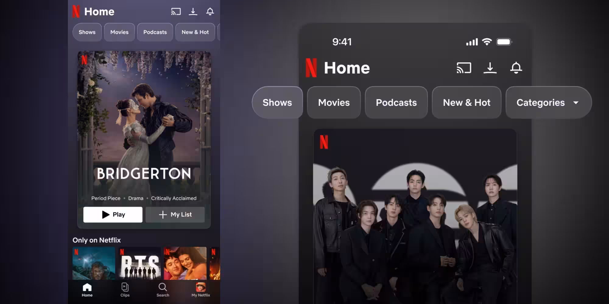
Netflix is changing its iPhone app in a way that feels overdue for a service people now use as much to browse as to watch. The update centers on a new vertical video feed called ”Clips,” plus a cleaner navigation layout that puts Search and Clips in the bottom tab bar and drops the old ”New & Hot” tab.
The company says the refreshed mobile experience is meant to make it faster, easier, and more fun to find something to watch, listen to, or play. That tracks with a broader industry shift: streaming apps are leaning harder into discovery tools because the real competition is not just other services, but your own attention span.
What changes in the Netflix iPhone app
The top navigation has been expanded with more options, while the bottom bar now puts discovery front and center. Netflix also says the new design is built around simplicity and a visual, vertical browsing experience that fits the phone screen better than the usual grid-and-menu routine.
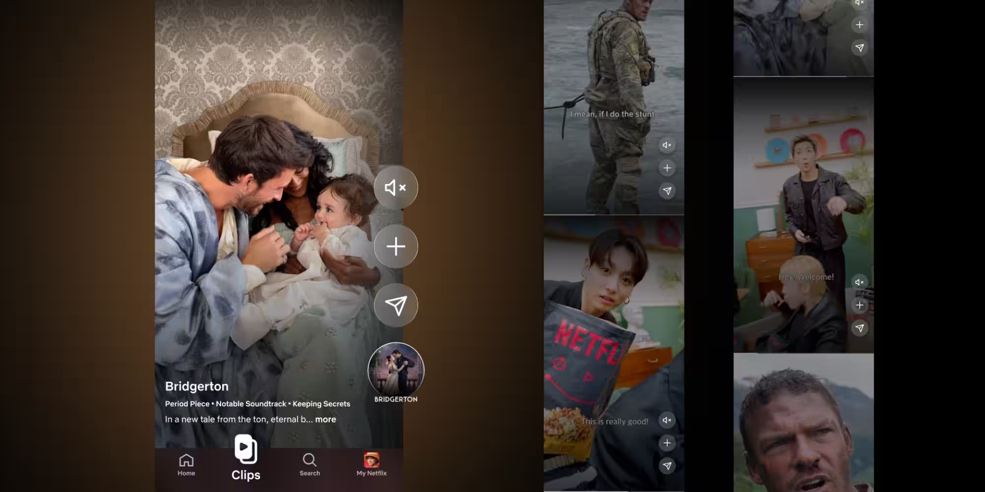
- ”Clips”: a vertical feed of personalized highlights
- Search: now a dedicated bottom tab
- My List: add titles directly from the feed
- Share: send recommendations to friends and followers from the feed
- Explore: browse personalized picks for different moods and occasions
”Clips” is the big swing here. Netflix describes it as a personalized highlight reel that helps people decide what to watch or play next without endless scrolling, which is an elegant way of admitting that endless scrolling has become the default problem to solve.
Netflix is borrowing the logic of short-form video
The feed is not just about trailers. Netflix says the feature will expand later to include podcasts, live programming, and collections built around genres or specific interests, including romance. That puts the company closer to the recommendation habits of TikTok and Instagram Reels, except Netflix is trying to point that behavior toward paid subscriptions instead of ad-driven doomscrolling.
The launch starts today in the US, the UK, Australia, Canada, India, Malaysia, Pakistan, the Philippines, and South Africa. Everyone else gets it in the months ahead, which sounds a lot like a standard staggered rollout – but also like a controlled test of whether people actually want another vertical feed in their life.
The redesign follows Netflix’s updated TV interface
Netflix updated its TV interface for the first time in more than a decade last year, and mobile now appears to be getting the same treatment. The company is clearly betting that better discovery can reduce decision fatigue, increase engagement, and maybe even make the app feel less like a warehouse of content and more like a guide.
The open question is whether users embrace a Netflix feed that behaves more like a social app. If Clips becomes a shortcut to the right movie or show, great. If it becomes another place to mindlessly flick past entertainment you meant to watch, Netflix may have just built a prettier version of the same old problem.