

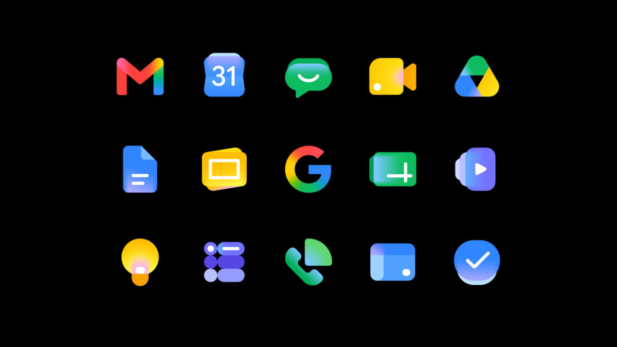
Google has started rolling out a new look for Gmail and the wider Workspace suite, and the company’s pitch is simple: the icons are meant to feel more modern, more distinct, and a lot less like they were designed in a hurry by committee. The Google Workspace icons redesign arrives as Gemini features spread across Workspace, which makes the timing obvious even if Google didn’t bother to explain it on stage at I/O 2026.
The company says the updated icons are part of a ”fresh visual identity” for Google Workspace apps. In practice, that means some familiar shapes are changing, while the overall Google brand language stays intact. It is a cosmetic move, yes, but one that also signals how much Google wants its productivity apps to read as a single AI-powered family rather than a pile of separate tools.
What changed in the Google Workspace icons
Google says the new designs are supposed to create ”consistency and cohesion” across the suite while keeping each app recognizable. Docs, Sheets, Slides, Keep, Forms, Sites, and Vids no longer sit on a paper-style background. Calendar, Meet, and Chat have also been softened up, losing their especially boxy edges.
There is one notable exception: Gmail remains the only Workspace icon that still uses all four Google colors. That makes sense. The envelope is one of Google’s most recognizable product symbols, and messing with it too aggressively would be a good way to annoy millions of people for no payoff.
The Gemini-era branding is doing a lot of work
Google is framing the redesign around the ”Gemini Era,” which tells you plenty about where the company wants the story to go. Gmail Live, Docs Live, and a new voice feature for Google Keep all showed up at I/O 2026, and the icons are now being asked to carry some of that AI-era momentum without changing how the apps actually work.
That split is familiar. Big tech companies often refresh product branding when they want users to feel that the software has moved on, even if the underlying experience is evolving more slowly. Microsoft did this for years across Office and Windows; Google is doing the same thing here, just with flatter shapes and less ceremony.
Gmail, Drive, Docs, and the rest are changing soon
The updated icons are rolling out to Gmail, Calendar, Chat, Meet, Drive, Docs, Slides, Sheets, Vids, Keep, Forms, Voice, Sites, and Tasks ”over the next several weeks.” Google also says the redesign does not change any core functionality or administrative controls, which is corporate-speak for ”don’t panic, your buttons still do the same thing.”
Still, icon refreshes are never just icon refreshes. They are a small but visible way to signal that a product suite is being reorganized around a new strategy, and in Google’s case that strategy is increasingly AI-first. The interesting question now is whether the rest of Workspace’s interface gets the same visual cleanup, or whether the new icons end up doing most of the branding heavy lifting on their own.