Making a presentation, infographic, or data viz used to mean learning design software or hiring someone who already had. AI tools for presentations have erased a lot of that friction. Now the real competition is between tools that can get you close fast and tools that can actually save you from the blank-page panic without turning the result into generic sludge.
That shift is biggest in business and education, where people want polished output from messy notes, spreadsheets, or a rough idea shouted into a prompt box. The catch is familiar: speed is up, but judgment still matters. AI can build the frame; humans still need to check whether the picture makes sense.
AI tools for presentations from notes to slides
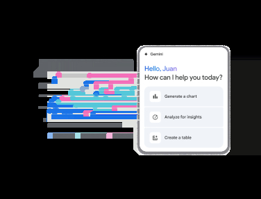
If your day job involves turning raw information into something a room can survive, the most useful AI tools are the ones that do structure, not just decoration. Canva’s Magic Studio can spin a full presentation from a text prompt, while its writing tools can help expand or tighten the copy inside it. Microsoft Copilot does similar work inside Word and PowerPoint, and Gemini can generate slides, charts, and graphs in Google Workspace.
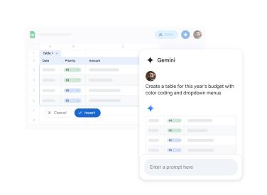
Google’s pitch is particularly strong for spreadsheet users: feed in Sheets data and it can turn that into charts and graphs without forcing you to become a formatting archaeologist. That’s the kind of small convenience that saves real time, which is why these tools are creeping into workplaces even when the output still needs a human polish pass.
FigJam AI takes a different route by converting text into flowcharts, mind maps, and organizational diagrams. Venngage, meanwhile, is more focused on infographics and classroom-friendly visual materials, which makes sense if your audience is students rather than executives pretending to enjoy quarterly updates.
Image generators are now part of the stack
Once AI image generation became a default feature, it stopped being a novelty and started being infrastructure. ChatGPT can generate visuals and even interactive data views, Adobe Firefly plugs neatly into Adobe’s creative tools, and Stable Diffusion still appeals to users who want more control and less dependence on a subscription.
Midjourney remains the name people reach for when they want images that look expensive without paying a designer, which explains why it built its reputation so quickly after launching in 2022. The quality gap with stock photography has narrowed a lot, but not enough to stop the occasional warped hand, odd shadow, or chart that looks confident and wrong.
- Best for presentations: Canva, Microsoft Copilot, Gemini
- Best for diagrams and flowcharts: FigJam AI
- Best for infographics: Venngage
- Best for custom visuals and images: ChatGPT, Midjourney, Adobe Firefly, Stable Diffusion
Video tools are getting unnervingly practical
AI video is still the most obviously synthetic of the bunch, which is also why it has such obvious business value. Synthesia can generate talking-head videos and voiceovers from text, making it much easier to create training content, course material, or multilingual updates without booking a studio every time a script changes.
That convenience is the whole point. If you need to update a statistic or rewrite a line, you regenerate the clip instead of starting from scratch. The trade-off is that AI presenters can still drift into uncanny-valley territory, which is a polite way of saying some viewers will notice the face before they notice the message.
The part AI cannot skip for you
The biggest mistake is assuming these tools are magic. They are faster, not smarter. AI visuals can be misleading, generic, or flat-out wrong, so charts and infographics still need fact-checking before they leave your desk and become someone else’s problem.
There is also the unglamorous stuff: prompts, design taste, and cost. Free tiers are common, but the useful features tend to sit behind subscriptions or usage-based pricing, and the bill grows quickly if you bounce between several platforms. Add the expectation that AI-generated visuals should be disclosed, and the shiny demo suddenly looks more like a workflow that still needs adult supervision.
As these tools spread, the winners will be the platforms that make polish feel effortless without hiding the controls from users who care about accuracy. The loser is the old idea that good visuals have to be slow. The next fight is over trust: how much AI-made work people will tolerate before they start asking who checked the numbers.