Sony is testing a small PS5 interface change that could save owners a few extra button taps every time they want the PlayStation Store, PlayStation Plus, or the Game Library. It is not flashy, which is probably why it is useful: the console’s current home screen has been doing too little with the DualSense shoulder buttons for years.
The PS5 beta update is showing up for some users, and it reshuffles the top menu bar so those system icons sit above the row of recent games. That would make the PS5 home screen feel less like a marketing carousel and more like a dashboard, which is exactly how a lot of people already use it.
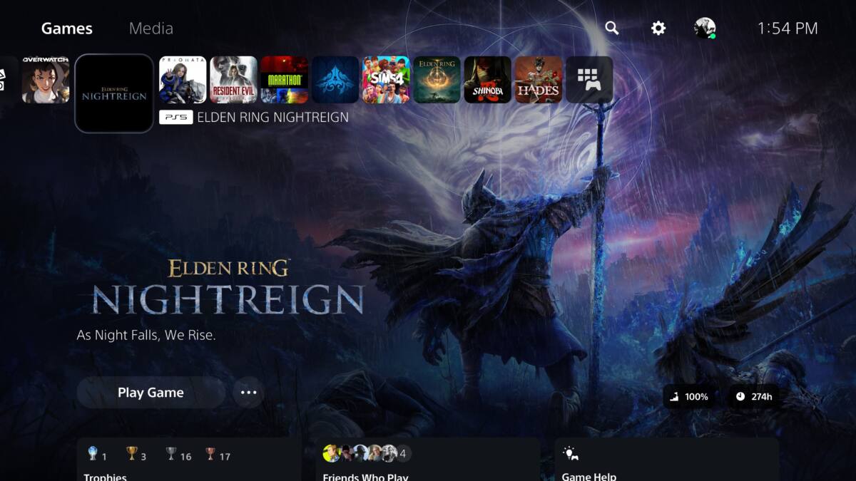
What changes in the PS5 home screen
Right now, the PS5 interface is split into two main areas: Games and Media. Games holds recent titles, the Welcome tab, and icons for core services; Media is where streaming apps like Netflix, YouTube, Crunchyroll, Spotify, and Twitch live. Players switch between them with L1 and R1, but that system has always felt slightly underused.
- PlayStation Store moves higher in the top bar
- PlayStation Plus moves higher in the top bar
- Game Library moves higher in the top bar
That is a modest tweak, but it also fits Sony’s recent pattern. The company added the customizable Welcome hub in 2024 after replacing the old Explore tab, and it has been steadily sanding down the PS5’s launch-era interface rather than rebuilding it. Rival consoles have spent more time chasing personalization and shortcuts, so Sony’s incremental approach is late, but not exactly shocking.
A small fix for a stubborn annoyance
This is the sort of change only a dedicated PS5 owner would call exciting, which is to say it will matter most to the people who use the console as a daily hub rather than just a game launcher. Moving the Store and Library closer to the top means fewer trips through the same menus Sony has asked players to babysit since the console launched in 2020.
Sony has not said when the PS5 beta update will reach everyone, and beta features have a habit of lingering longer than they should. If this one survives testing, expect it to become one of those rare UI changes people barely notice after a week – mostly because they stop being annoyed by it.