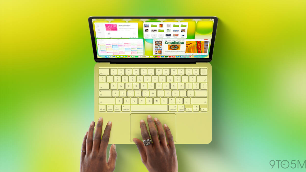
Apple has finally updated its US MacBook keyboards to replace several key text labels with glyphs, aligning them with the rest of the world’s Apple keyboards. The new MacBook Air, MacBook Pro, and MacBook Neo now feature iconic symbols for keys like Tab, Caps Lock, Return, Shift, and Delete-keys that until recently carried full text labels only in the US. In a deliberate decision, Apple has kept text on some keys, blending symbols and words for improved user clarity.
This change ends a longstanding US exception where Apple used text labels like ”Shift” or ”Delete” instead of glyphs such as ⇧ or ⌫, symbols that have adorned Apple keyboards internationally for years. However, Apple retained some text labels: the Escape (Esc) and Function (Fn) keys remain abbreviated in text form, while Control, Option, and Command keys display both glyphs and their names, continuing a hybrid approach.
The decision reveals Apple’s practical balancing act between design consistency and user comfort. While glyphs look cleaner and align visually with macOS interface elements, they can complicate verbal instructions and documentation. Apple’s own support materials historically refer to keys by name rather than symbol-for example, ”Option-Shift-Command-K” instead of ”⌥⇧⌘K.” For tech novices, text labels help clarify which keys to press when following spoken or written instructions.
The presence of text on the Esc and Fn keys likely reflects their less frequent mention in everyday usage or instructions, while modifier keys such as Control (⌃), Option (⌥), and Command (⌘) still receive textual cues alongside icons to minimize confusion. This dual-label approach recognizes that some keys are intuitive via symbols alone, like Shift or Tab, whereas others benefit from supplementary text, especially in wider or more casual user contexts.
Apple’s update to keyboard labeling also underscores a shift toward a universal design language across its hardware lineup, narrowing differences between US and international models that have persisted for years. It suggests a subtle prioritization of visual minimalism balanced with accessibility, aiming to please both seasoned Apple users familiar with glyphs and newcomers who rely on text cues.
Looking ahead, this hybrid labeling might set a precedent for future Apple keyboards or other accessories, where a mix of iconography and text helps bridge the gap between aesthetics and usability. Whether this approach gains popularity beyond Apple or in third-party keyboard makers remains an open question, especially as younger generations grow more comfortable with icons and less with traditional labels.