Tiny curves are coming to KDE Plasma’s selection highlights. On the surface it’s a cosmetic tweak – rounded corners in menus and lists – but it signals something larger: KDE is tying together two historically different UI toolkits and moving toward a single, consistent styling system.
The change appears in development for Plasma 6.7. The KDE community’s weekly ”This Week in Plasma” update and an upstream Breeze merge request note that selection highlights in Breeze-themed QtWidgets apps such as Dolphin, Okular, and KMail will adopt the same rounded look long used in QtQuick-based apps.
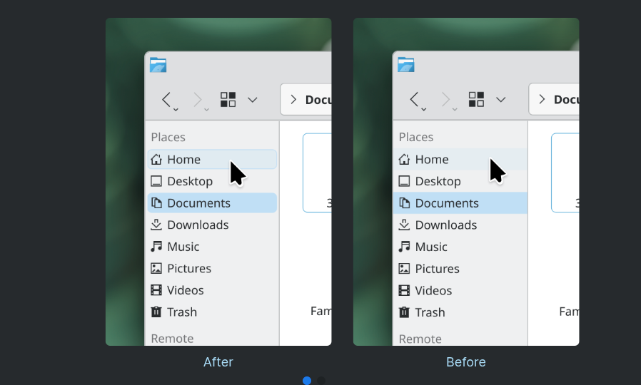
Rolled out the beginnings of a new rounded style for selection highlights in Breeze-themed QtWidgets-based apps, like Dolphin, Okular, and KMail. This brings them the style we’ve been using for years for list highlights in QtQuick-based apps and menu items everywhere, and paves the way for all of them to be consistently styled from a central location by the upcoming Union styling system. (Akseli Lahtinen and Marco Martin, breeze MR #583)
KDE
Plasma 6.7 will also add a Vietnamese lunar calendar option in the Digital Clock widget, a clearer favorite alert in the Kickoff app, and a toggle to revoke all remote-cast sessions from the Application Permissions page. The release is expected around June, as development continues after Plasma 6.6.
What this fixes
KDE has long supported apps built on two different stacks: QtWidgets (the older C++ widget system) and QtQuick (the QML-based UI toolkit). Historically, those stacks received slightly different visual treatments, which produced inconsistent-looking menus and lists across apps. Rounder highlights are a cosmetic fix, but the bigger win is that they point toward a centralized style: the Union styling system referenced by KDE.
- More consistent appearance between QtWidgets and QtQuick apps
- Easier theming and maintenance if styles are managed from one place
- Fewer visual surprises for users switching between KDE apps
That last point matters: consistency reduces friction for users, and a central styling layer reduces duplicated design and maintenance work for developers.
Where this fits in the wider UI trend
Rounded corners aren’t unique to KDE. Apple and Microsoft both moved toward softer edges in recent macOS and Windows releases, and many modern Linux toolkits and themes follow the same visual language. KDE’s change is less about keeping up with aesthetics and more about removing toolkit fragmentation so a single style can be applied everywhere.
Who wins, who loses
Winners: end users, who get a cleaner, less jarring desktop; theme authors, who will eventually style one system instead of two; and KDE maintainers, who can apply fixes centrally.
Losers – if any: niche themes or workflows that rely on the old precise geometry could need tweaks. There’s also a small risk that centralizing styles reduces per-app flexibility, which some developers have used intentionally. Those trade-offs are common when projects move from ad hoc, app-by-app styling to a single unified system.
What to expect next
Expect more incremental visual alignment in the months leading to Plasma 6.7. The rounded highlights are an early visible step toward the Union styling system. After the visuals land, theme authors and distro integrators will test and update their packages. For users, it’s a low-risk aesthetic improvement; for developers and themers, it signals a period of consolidation and follow-up adjustments.
Small UI details often tell a larger story. In this case, a few pixels of curve are an outward sign that KDE is trying to make its desktop feel coherent again – and to make it easier for designers and developers to keep it that way.