Apple’s next iPhone software refresh may finally make Liquid Glass feel less like a nice-looking compromise and more like a finished design. A new Bloomberg report says iOS 27 will bring systemwide tweaks, including redesigned tab bars, and that’s the part that could quietly undo one of iOS 26’s most irritating habits: hiding navigation behind an extra tap.
That sounds small until you use it every day. The current setup looks slick, sure, but on apps like Photos, Music, and Podcasts, the bottom bar often collapses into a single icon while you scroll, then makes you dig it back out before switching tabs. Apple may have chased visual cleanliness a little too hard; iOS 27 looks like the first chance to put usability back in the driver’s seat.
What Bloomberg says is changing in iOS 27
Mark Gurman’s report says iOS 27 will include noticeable design changes across Siri, system search, Safari, Image Playground, and Weather, plus new animations and redesigned tab bars. One detail stands out: Apple is reportedly tweaking the bottom tab bar in several apps so the search tab is folded back in with the rest of the tabs.
That would be a meaningful reversal. In iOS 26, Apple split search into a separate button in some places and made tab bars more translucent, but the collapsing behavior turned routine navigation into a little two-step dance. Apple has already shown it can walk parts of that back: the App Store and Games restored integrated search in iOS 26.4 and do not minimize the bar.
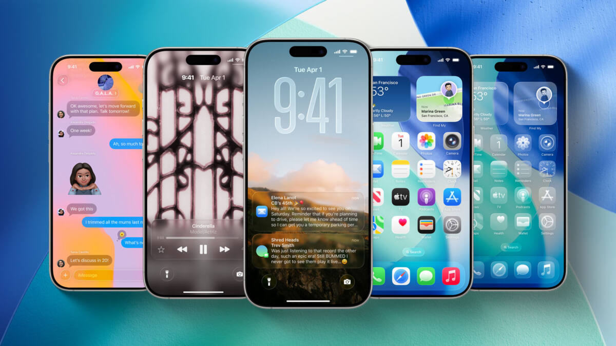
Why the current Liquid Glass tab bar design feels unfinished
There’s a reason this complaint has stuck. News, Books, and TV keep their tab bars visible as you scroll, while other apps hide them away. That inconsistency makes the interface feel less like a coherent system and more like a collection of experiments that never quite agreed on the rules.
Apple usually earns points for iterating after feedback, and this is exactly the kind of polish pass it tends to make after a flashy redesign settles down. If iOS 27 restores a persistent tab bar while keeping the Liquid Glass look, Apple gets to keep the style without making people fight the UI every five minutes. A rare win-win, which is almost suspicious.
The iOS 27 change users will actually notice
The other rumored detail is a new keyboard animation that shows keys sliding up from the bottom of the interface. Fine, that’s cute. But the real test is whether Apple stops treating basic navigation like an optional accessory and makes tab switching direct again.
- Search integrated back into the main tab bar
- Less or no collapsing of bottom navigation while scrolling
- A cleaner Liquid Glass look without the extra tap tax
If Gurman’s report is right, the most likely outcome is simple: iOS 27 makes tab bars stay visible more often, and Apple quietly fixes the most annoying part of Liquid Glass without admitting the original version was a little too clever. The interesting question is whether that correction ends with tab bars, or whether Apple uses iOS 27 to tone down more of the design decisions that looked better in screenshots than in daily use.