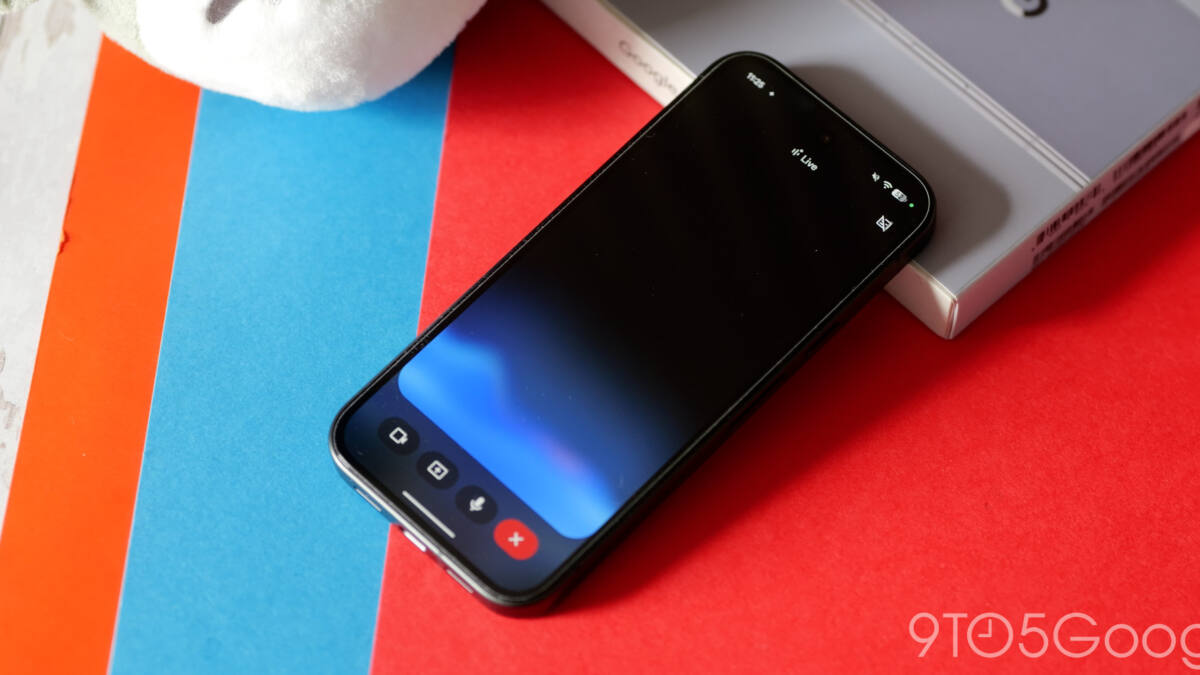
Google is testing a cleaner Gemini Live interface on Android, and the biggest change is also the most obvious one: the fullscreen takeover is gone. In beta version 17.14 of the Google app, Gemini Live now sits on top of the Gemini app homepage instead of blanketing the screen, which makes it feel less like a mode switch and more like a chat feature with a few extra tricks.
The Gemini Live Android redesign also makes the controls easier to understand at a glance. The top bar now says ”Live with Gemini” and includes the transcript button, while the bottom area swaps the old prompt box for a pill-shaped control with the blue waveform, camera, and screen sharing on one side, and microphone mute on the other. That is a small interface change on paper, but it fixes a common problem with Google’s earlier test design: hidden gestures are clever until people have to guess them.
What changed in Gemini Live
Compared with Google’s previous test, this version is much more direct. The earlier minimalist layout hid muting behind a double-tap gesture on the waveform, while the new one puts the controls in plain sight and lets the keyboard button end Live mode, along with the system back gesture. It is a classic product trade-off: a little more visual weight, but far less confusion.
- Fullscreen interface removed from Gemini Live on Android
- ”Live with Gemini” label added to the top bar
- Transcript button now visible in the header
- Camera and screen sharing moved into the bottom control pill
- Microphone mute is now shown instead of hidden
Why Google is backing away from fullscreen
The fullscreen treatment was always visually dramatic, which is often another way of saying ”hard to ignore.” That may have worked in demos and marketing, but live voice tools are becoming a crowded category, and Google is no longer the only company trying to make conversational AI feel less like a science project. Apple, OpenAI, and others have spent the past year pushing more contained, less intimidating interfaces, and Google’s update fits that broader shift toward tools that stay useful without taking over the whole display.
The redesign is currently showing up widely for Google app beta users on Android, and for now it applies only inside the Gemini app. The overlay still looks the same today, though Google is expected to bring the same design language there too. That would make sense: once the app version becomes the new normal, leaving the overlay behind would just be Google preserving an old habit for no good reason.
What to watch in the next rollout
The open question is whether Google keeps the new layout conservative or starts using it as the template for more Gemini surfaces. If the company wants Gemini Live to feel like a daily utility rather than a flashy showcase, this move is a decent start. If not, expect another redesign to arrive before anyone has finished learning the current one.